2018-2019 (Co-op)
UX Design
Graphic Design
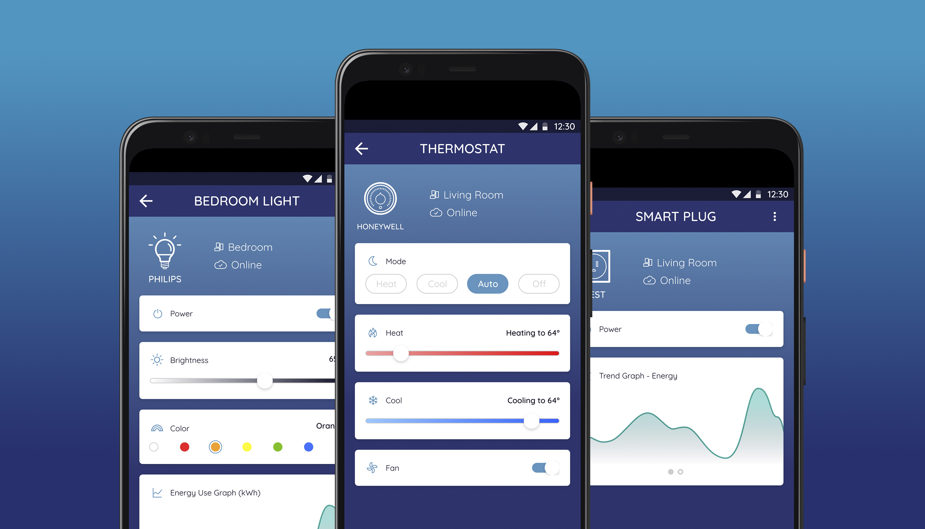
The current device details screen is outdated and lacks meaningful functionality. The users need a way to clearly understand and control their device statuses within the mobile app.
While it shows information and controls, it doesn’t help users efficiently monitor or manage their devices, especially compared to the other redesigned parts of the app. Also, why wouldn’t homeowners use their devices' native apps instead of Alana, even if it means downloading several apps instead of just one app where it acts like the hub.
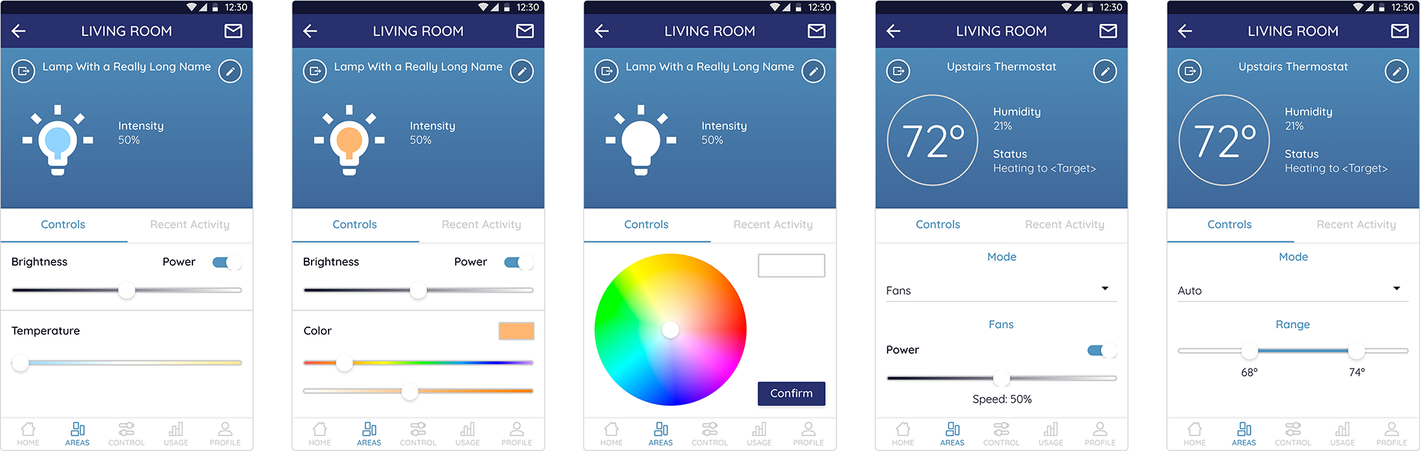
I explored different UI variations on paper and wireframes while gathering inspiration from other smart home apps. This helped to see how it would look like on screen, how the elements would look like in the screen real estate and what information was needed for the redesign.
The design process took several meetings with executives, product managers, and developers to align design vision, customer needs, business goals, and to get feedback for my designs.
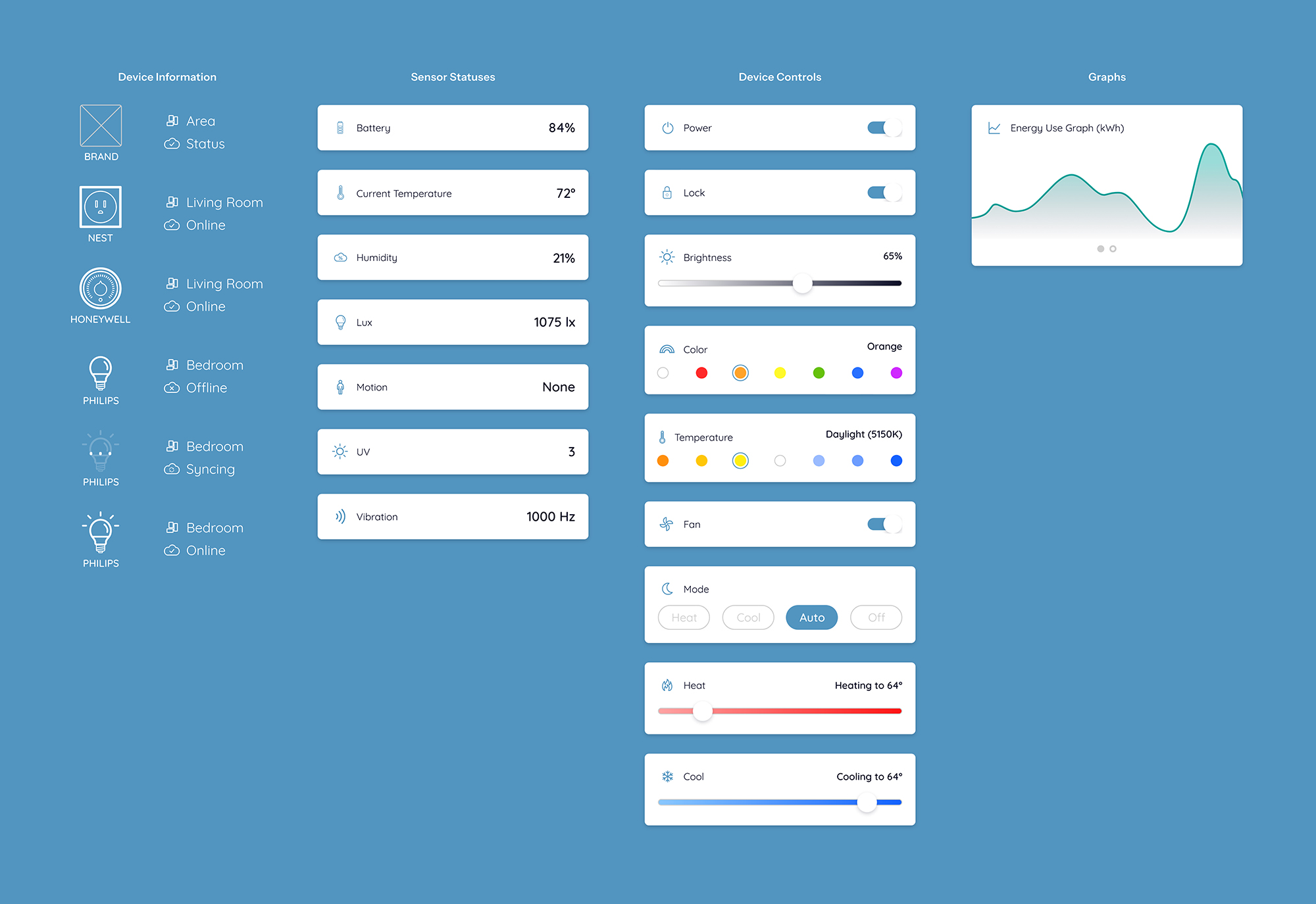
To create a more scalable and user-friendly experience, I designed the device details screen using a modular approach. Each section is treated as a component that can appear or disappear depending on the device’s capabilities. For example, if a device only includes controls and energy graphs but doesn’t track sensor statuses, the sensor status component is simply omitted.
Information Hierarchy:
1. Device Information
2. Device/Sensor Statuses
3. Device Controls
4. Energy Graphs
This modular approach ensures a clear and consistent hierarchy while allowing flexibility across different device types. It also simplifies development, since the backend can adapt to missing elements without requiring major design changes. It also reduces reliance on text-heavy readouts, minimizing localization efforts if the app is translated into other languages.
Overall, this modular system streamlines the device details UI, making it more cohesive while giving users a flexible and intuitive experience.
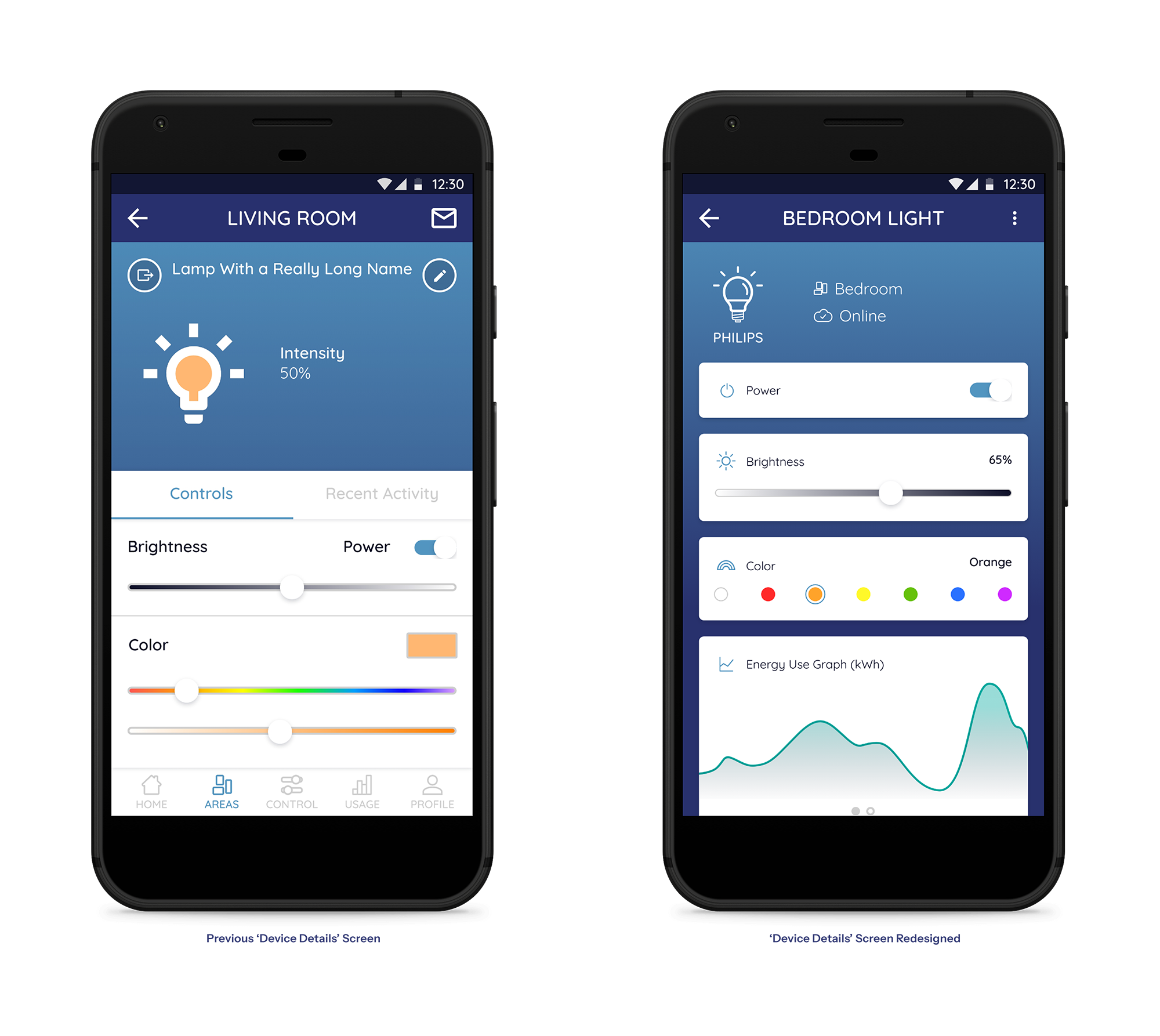
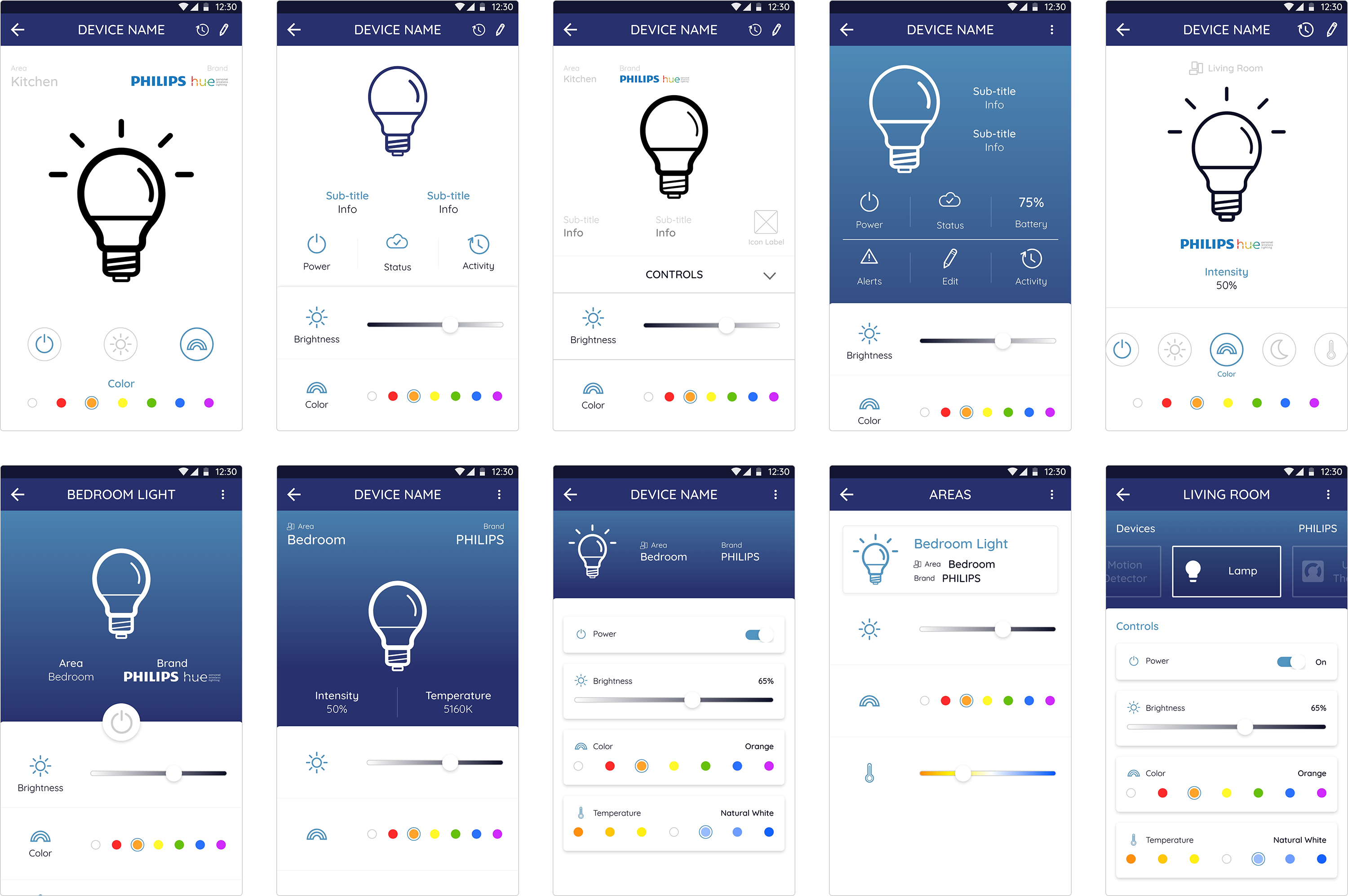
In the previous design, a significant portion of the screen was dedicated to a large device icon. While the icon indicated the device type and state, it offered little functional value. This emphasis reduced the space available for more critical information, such as sensor statuses, controls, and energy graphs — ultimately limiting the reasons for homeowners to use Alana over the device’s native app.
In the redesign, I shifted the focus toward utility by prioritizing device controls, ensuring homeowners can quickly and effectively manage their devices, especially when away from home. The device icon was minimized and repositioned to a corner, serving as a subtle visual reference rather than the main focal point.
In the early stages of this project, I fell into the trap of pushing designs to look overly different or “overly intuitive” compared to the original. While these explorations were creative, they lacked consistency with the rest of the app and would have required significant development effort to implement.
Recognizing this, I shifted my approach. I researched other smart home apps to understand best practices and identified what worked well for users. I also collaborated cross-functionally with stakeholders, including leadership, product managers and developers, to gather feedback and ensure the designs were both valuable to users and feasible to implement. From there, I refined my solutions to deliver real value while maintaining alignment with the app’s established visual language.
This experience reminded me of the importance of balance in design, knowing when to explore bold ideas and when to pull back to create solutions that are practical, consistent, and implementable. It also reinforced how valuable cross-functional collaboration is in shaping designs that meet both user needs and business goals.