Current (Freelance)
UX Design
Visual Design
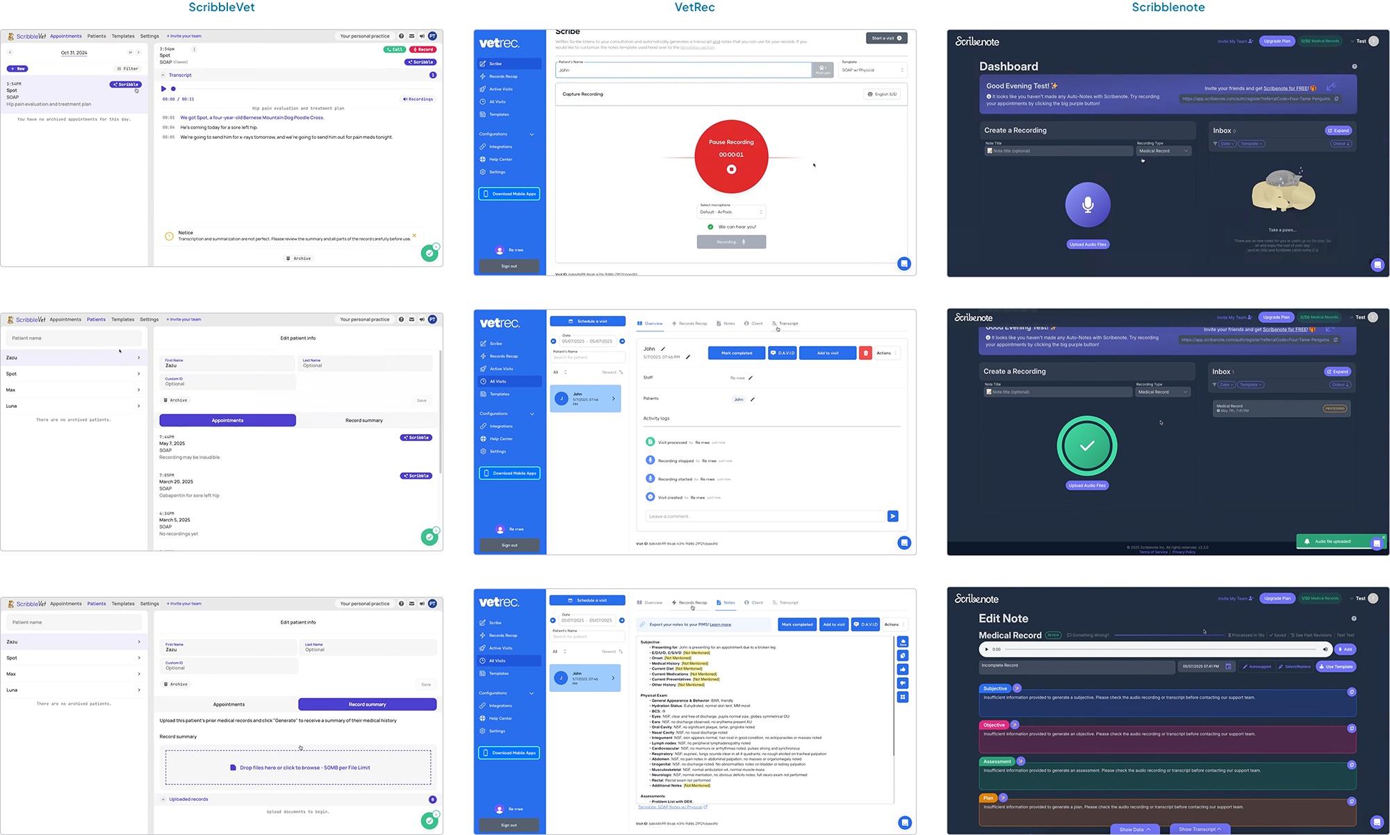
I analyzed other vet scribe apps to identify similarities and differences in their approaches for user flow, user interaction, and information architecture.
A major focus was understanding how they structured the case flow, specifically the interface layout and processes when vets are recording cases.
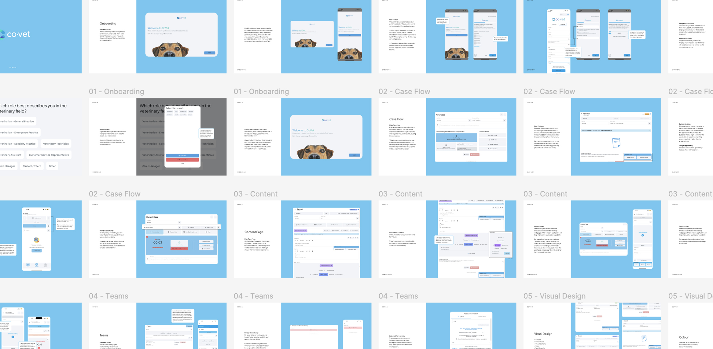
I conducted an in-depth review of CoVet’s mobile and desktop apps to uncover pain points, usability challenges, and design opportunities.
Key Findings:
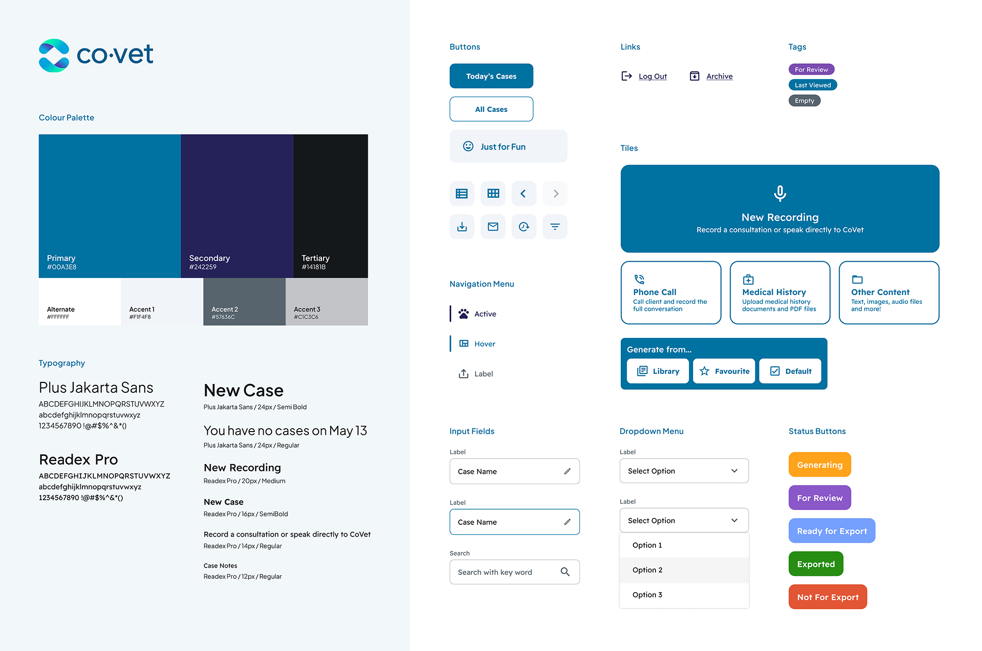
Created a style guide to establish a shared visual language for CoVet’s internal team. I ensured consistency and scalability across UI elements while adhering to WCAG guidelines & recommendations. The guideline included colour usage, typography, breakpoints, and native app components (buttons, text fields, dropdowns, etc.).
This streamlined brand guidline helped with the design handoff process, allowing for easy collaboration and future iterations.
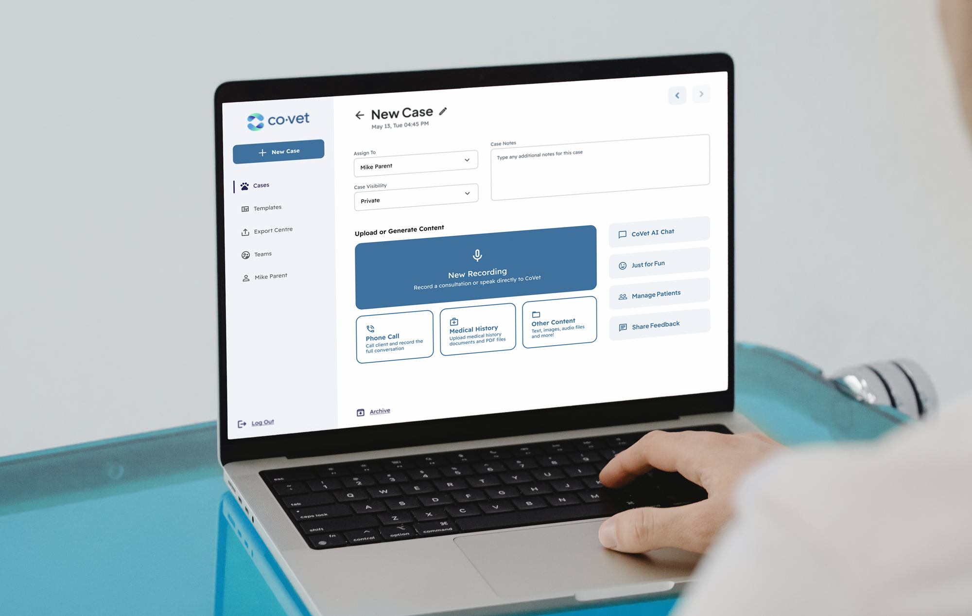
Provided UX design recommendations for the case screens, focused on improving the end-to-end experience of case creation, informed directly by audit insights.
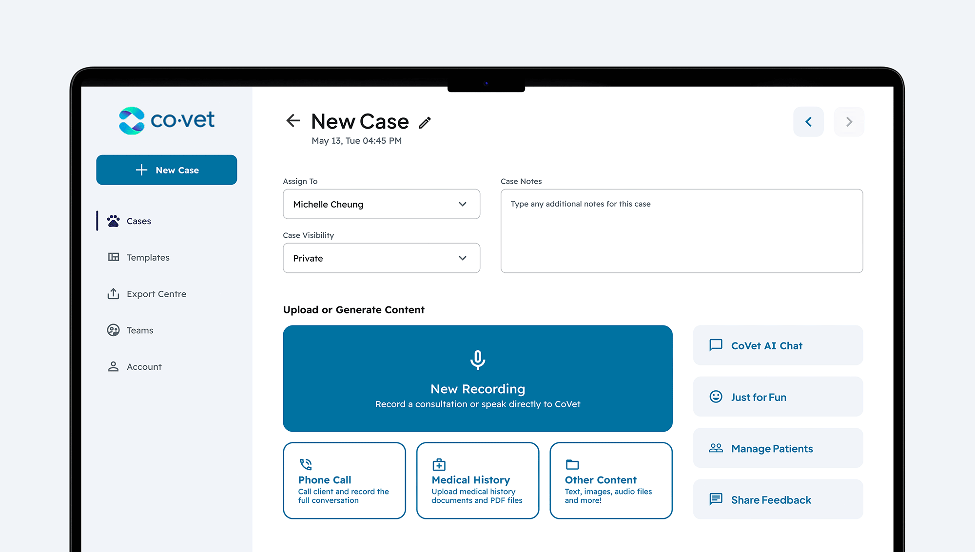
One user pain-point was that the inital case creation screen felt cluttered with too many functions and features.
To address this, I simplified the top section of the screen by reducing the space taken up by input fields. The previous layout had 5 user input fields across 2 rows, while the new layout reorganized and prioritized the most essnetial fields to support the vet's in their day-to-day task.
I also applied the new brand guideline for colour, buttons, and spacing to establish a clearer visual hiarachy. This helped draw attention to the screen's primary action, the "Start Recording" button.
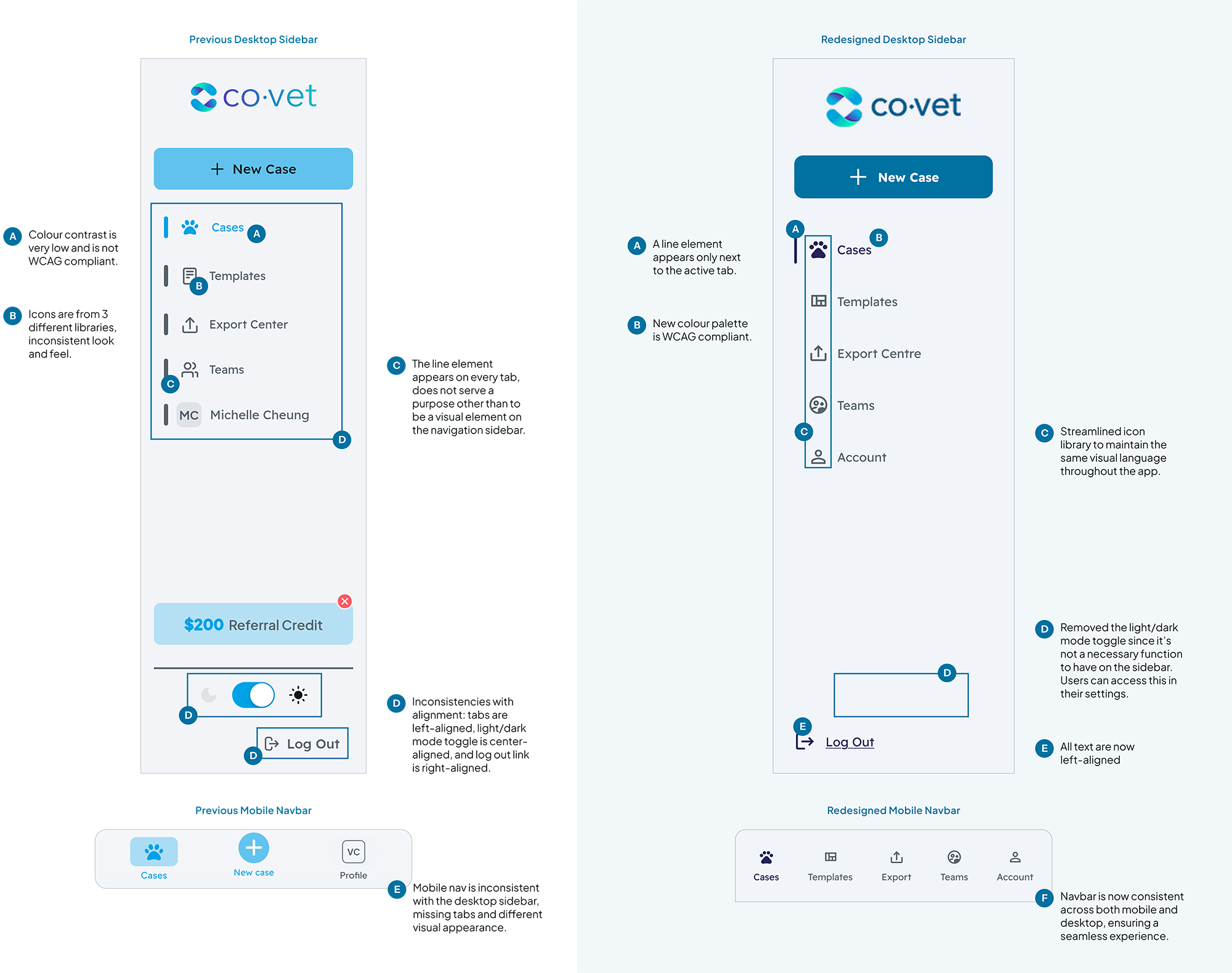
I redesigned the navigation sidebar to align with industry standards and accessibility guidelines, with a focus on improving active and inactive states.
The previous sidebar used colour as the only visual indicator of the active screen, which was not accessibility compliant. For example, users with colour-blindness would be unable to decipher which is the active screen.
The updated sidebar introduces mutliple visual cues to clearly indicate the active screen. Additionally, the navigation is now consistent across scaled viewports, ensuring a seamless experience on both mobile and desktop.
One of the most valuable lessons from this project was the importance of cross-functional collaboration with the leadership and working within constraints.
Since the team relied on a drag-and-drop app builder, there were technical limitations on how much the redesign could change. With limited time, resources, and scope, I learned to think creatively, prioritize effectively, and communicate the value of my design decisions via UX walkthroughs. Utimately, I was able to demonstrate to leadership that these design enhancements were essential for retaining and attracting users.
By embracing these constraints, I addressed key design opportunities identified during the aduit and successfully improved the user experience of CoVet's desktop and mobile apps.